Anthony Bourdain changed the way I looked at the world. This portrait explores the curiosity, connection, and symbolism that made his work so influential in my own life.
Read moreRenaissance Charlotte SouthPark Hotel Lobby Mural | Kyle Mosher
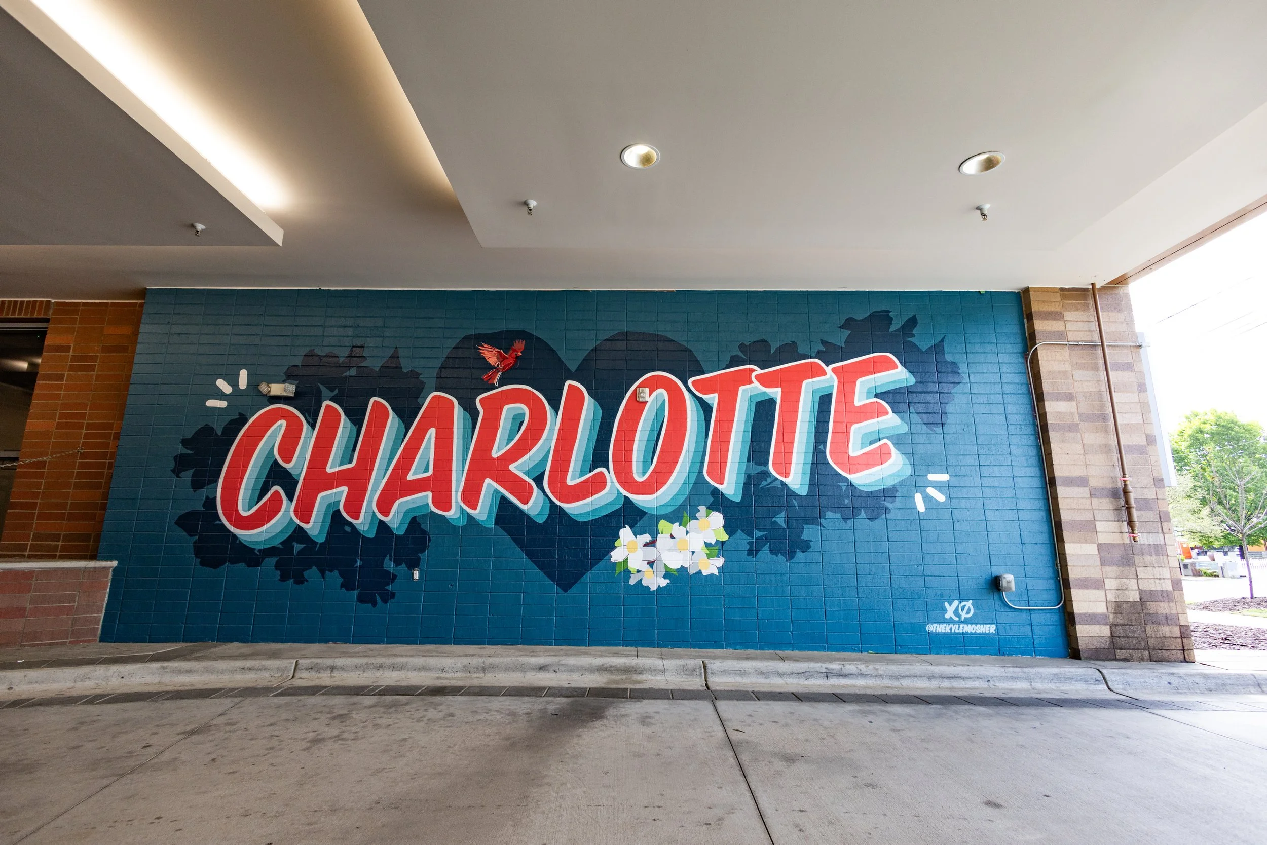
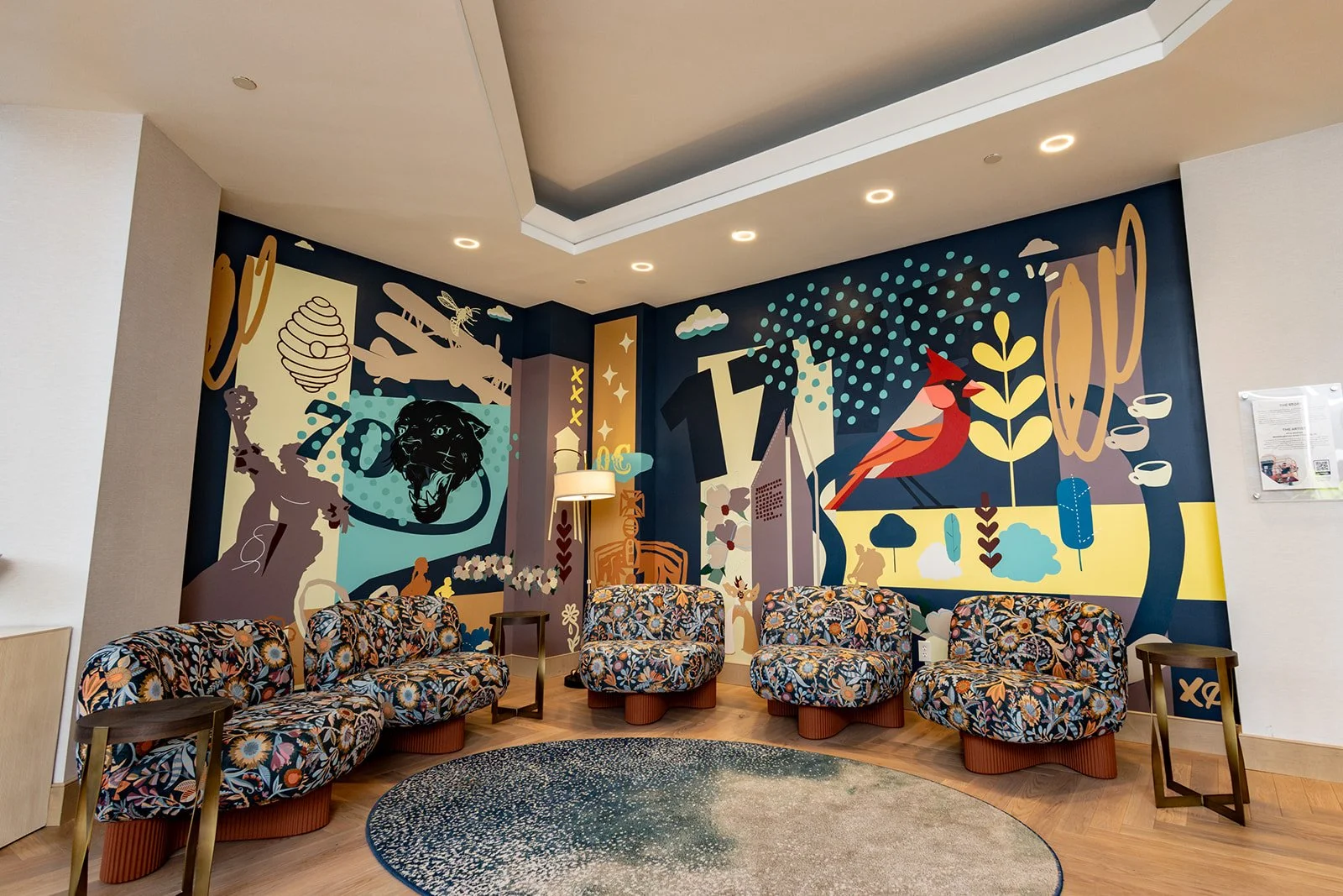
When designing this mural, I wanted to create something that felt like discovering Charlotte for the first time. Rather than focusing only on the city's most recognizable landmarks, I pulled together both iconic symbols and the smaller details that give Charlotte its personality.
Inspired by the Renaissance brand's spirit of discovery, the mural layers together references to the city's history, aviation, native wildlife, architecture, local culture, and everyday moments. Each element acts as its own little discovery, encouraging guests to slow down, look a little closer, and notice something they may have missed the first time.
The end result is a colorful visual portrait of Charlotte that celebrates not just what the city is known for, but what makes it worth exploring.
Reckless Optimism | New Contemporary Horse Illustration Print by Kyle Mosher
Reckless Optimism started as an experiment. I wanted to keep pushing this direction I've been exploring lately, combining classical imagery with my own graphic style and seeing where it led.
One of my favorite painters has always been Jacques-Louis David. His iconic equestrian portrait Napoleon Crossing the Alps served as a loose source of inspiration for this piece. I wasn't interested in recreating the painting, but rather capturing some of its energy, movement, and confidence through my own visual language.
The title came almost immediately. It felt right from the start, and I didn't overthink it.
To me, Reckless Optimism is about choosing to move forward even when nothing feels certain. Sometimes believing things will work out is a revolutionary act, one that's just a little reckless.
This piece is full of the small details I love hiding throughout my work, and I hope every time you look at it, you discover something new.
Mac Miller "Don't Trip" Fine Art Portrait by Kyle Mosher (2026)
Swimming came into my life during a strange chapter of my career. I'd already been a full-time artist for several years, but I was starting to experience a different kind of pressure. The excitement of "making it" had slowly been replaced by the pressure to keep growing, keep creating, and keep proving to myself that I belonged here.
Mac had a way of writing about those feelings without making them feel hopeless. There was always this balance of honesty, gratitude, and optimism that kept me coming back to that album.
When I started this portrait, I knew I didn't want it to be just another likeness. I wanted it to reward a second look.
Throughout the piece are small references to Mac's life and music, including Pittsburgh, his hand-drawn smiley face, hidden "MM" initials, a custom interpretation of his flower tattoo, and the subtle "Don't Trip" typography inspired by the hat he wore during his legendary Tiny Desk performance.
One of my favorite parts of making artwork like this is hiding those little details in plain sight. Some people will notice them immediately, and others might not catch them until they've lived with the piece for a while.
Sidney Crosby in My Signature Illustration Style
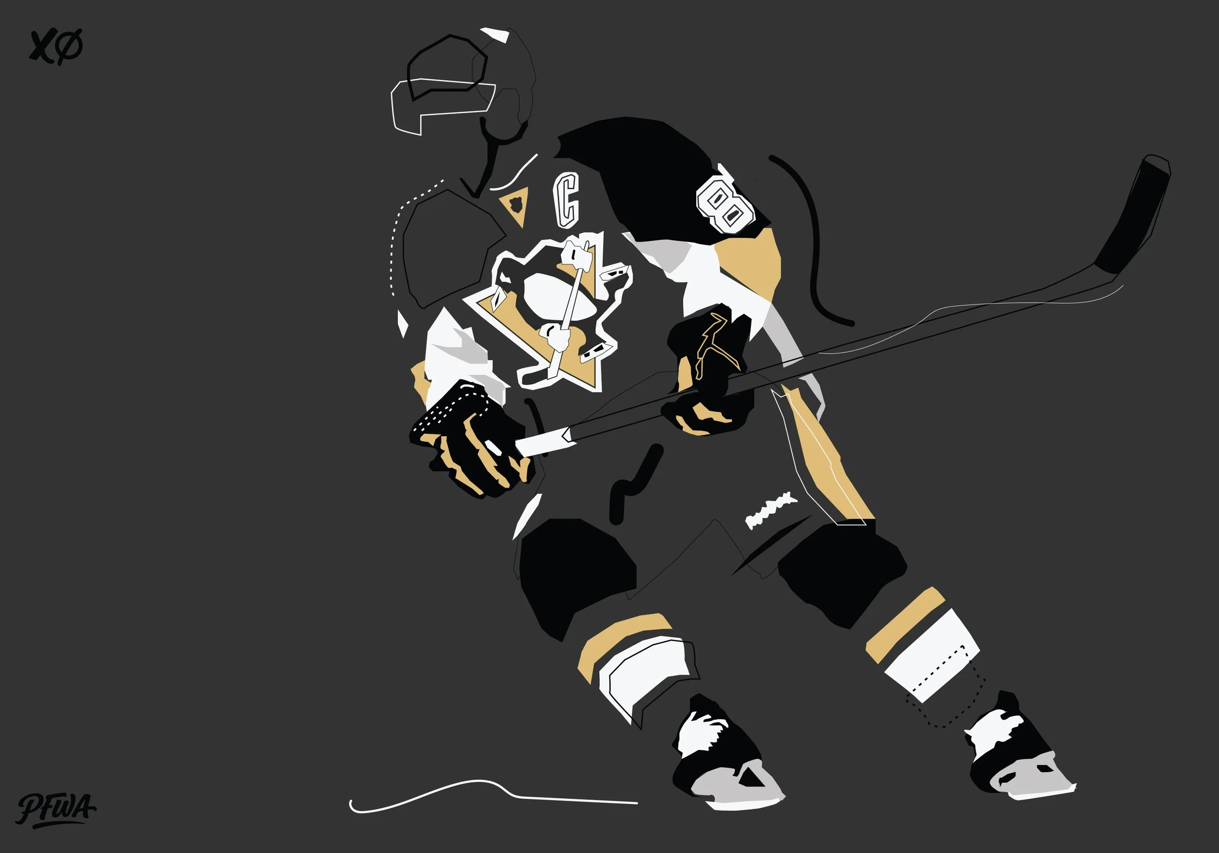
Sidney Crosby has been one of the defining players of the modern NHL for nearly two decades. His vision, consistency, and leadership have made him one of hockey's most respected athletes, and he felt like a natural addition to this growing series.
Like the rest of the collection, this piece strips away unnecessary detail and focuses on shape, movement, and color. Rather than chasing realism, I wanted to capture the energy of the moment using bold graphic forms, minimal linework, and the iconic black and gold of the Pittsburgh Penguins.
This illustration is part of an ongoing series celebrating some of hockey's most recognizable players through my signature visual language. I'm excited to keep expanding the collection with athletes whose style and impact have helped shape the game.
Limited edition prints are available in the shop. Every print is hand-signed, numbered, and printed on archival paper with a certificate of authenticity. Available for purchase here.
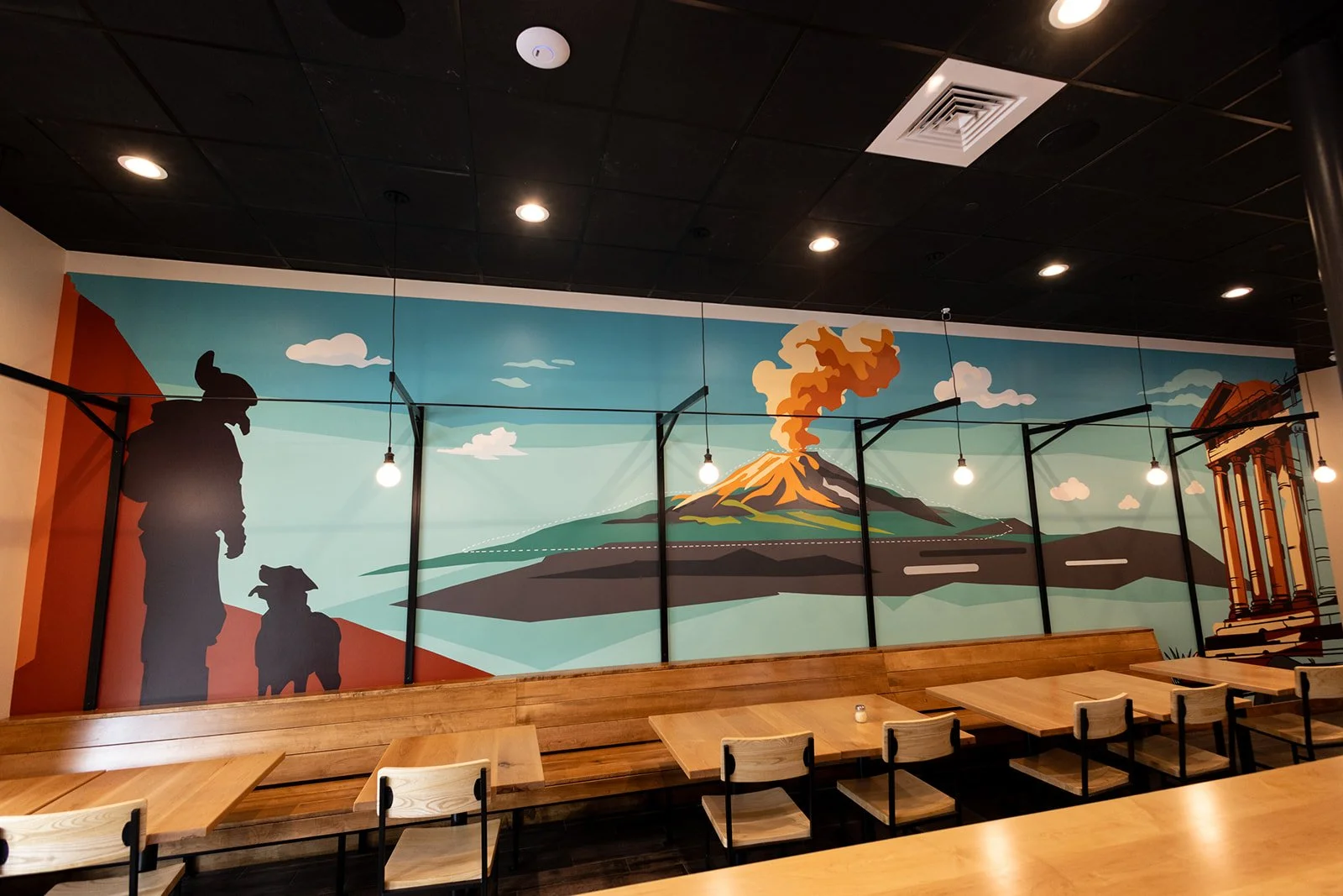
Inizio Pizza Cotswold Mural | Charlotte, NC
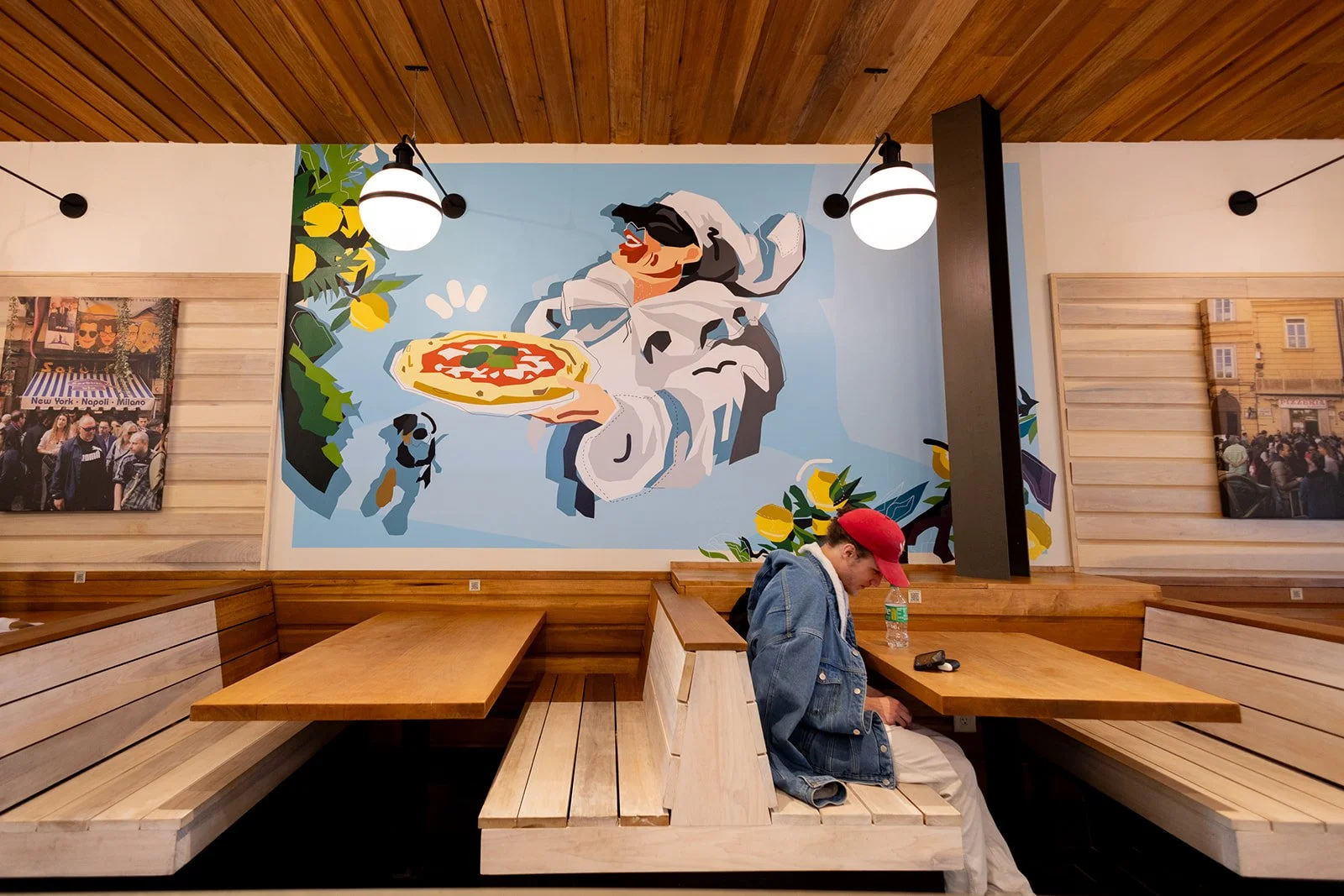
I recently completed this custom mural for the new Inizio Pizza location in Cotswold, Charlotte.
From the beginning, the direction was to create something that felt rooted in Italy without becoming overly detailed or literal. I leaned into a minimal graphic approach inspired by vintage travel posters and postcards, using large shapes, a limited color palette, and clean compositions to let the architecture and space breathe.
The client had two specific requests: to include Pulcinella, a classic figure from Italian folklore often associated with Naples, and a dog as a subtle personal touch. Those elements became part of the larger story, sitting alongside Mount Vesuvius and other Italian-inspired references to create a mural that feels both playful and intentional.
Big thanks to the Inizio team for trusting me with another wall.
Beyond the Wall
Over the last few years, I've worked hard to grow both my own brand and The Mural Crew into something bigger than just painting walls.
Murals will always be at the core of what I do, but as the projects have grown, so have the opportunities. Lately, that's meant expanding into custom art installations, dimensional signage, sculptural elements, and 3D printed pieces. It feels like a natural next step as clients look for more immersive ways to transform their spaces.
The process hasn't changed. Every project still starts with an idea and is built specifically for the space. Sometimes that solution is paint. Sometimes it's fabrication. Most of the time, it's a combination of both.
I'm excited to keep pushing the work forward and continue creating spaces that people remember long after they leave.
Trella Uptown Leasing Office Mural | Charlotte, NC
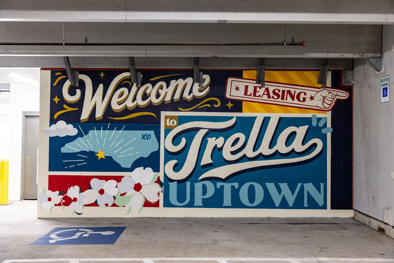
I recently partnered with Trella Uptown to create a custom mural for their leasing office and parking garage entrance in Uptown Charlotte.
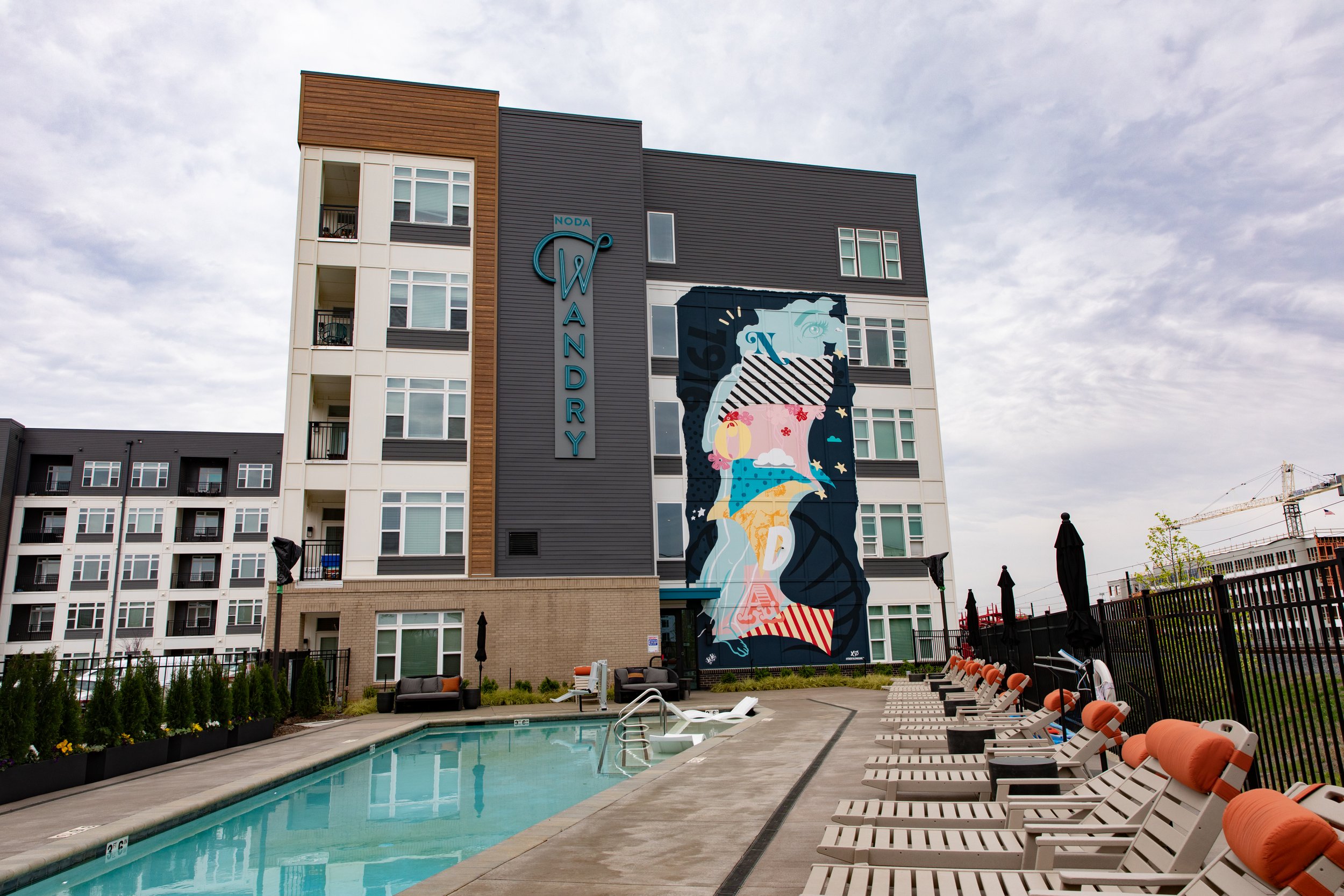
The goal was simple: create an immediate sense of arrival. Using large-scale typography, North Carolina-inspired imagery, and Trella's brand colors, I designed a mural that transforms an otherwise utilitarian space into a welcoming visual landmark for residents and visitors.
The piece features a hand-lettered "Welcome to Trella" message alongside state-inspired graphics, dogwood flowers, and vintage sign-painting influences. I wanted the mural to feel optimistic, approachable, and distinctly Carolinian while remaining connected to the property's visual identity.
Projects like this are a reminder that great placemaking doesn't have to happen in a lobby. Sometimes the first impression of a property happens in a parking garage, and thoughtful design can completely change that experience.
Huntington Bank South End Mural | Charlotte, NC
I recently partnered with Huntington Bank to create a custom mural for their first Charlotte location in South End.
The goal was to create something that felt authentic to both the brand and the neighborhood. I leaned heavily into Huntington's signature green palette, building a tonal composition that integrated seamlessly with my illustration style while remaining unmistakably connected to the bank's visual identity.
The mural combines bold typography, hand-drawn illustrations, and Charlotte-inspired imagery to create a welcoming focal point for customers and visitors. Elements throughout the piece reference themes of growth, community, and local character while helping establish a strong visual presence within the space.
One of my favorite aspects of this project was finding the balance between brand integration and artistic expression. Rather than simply applying corporate colors, I used them as a foundation to build a mural that feels unique to this location and reflective of South End's creative energy.
Thank you to Huntington Bank for trusting me with this project and for supporting public art in Charlotte.
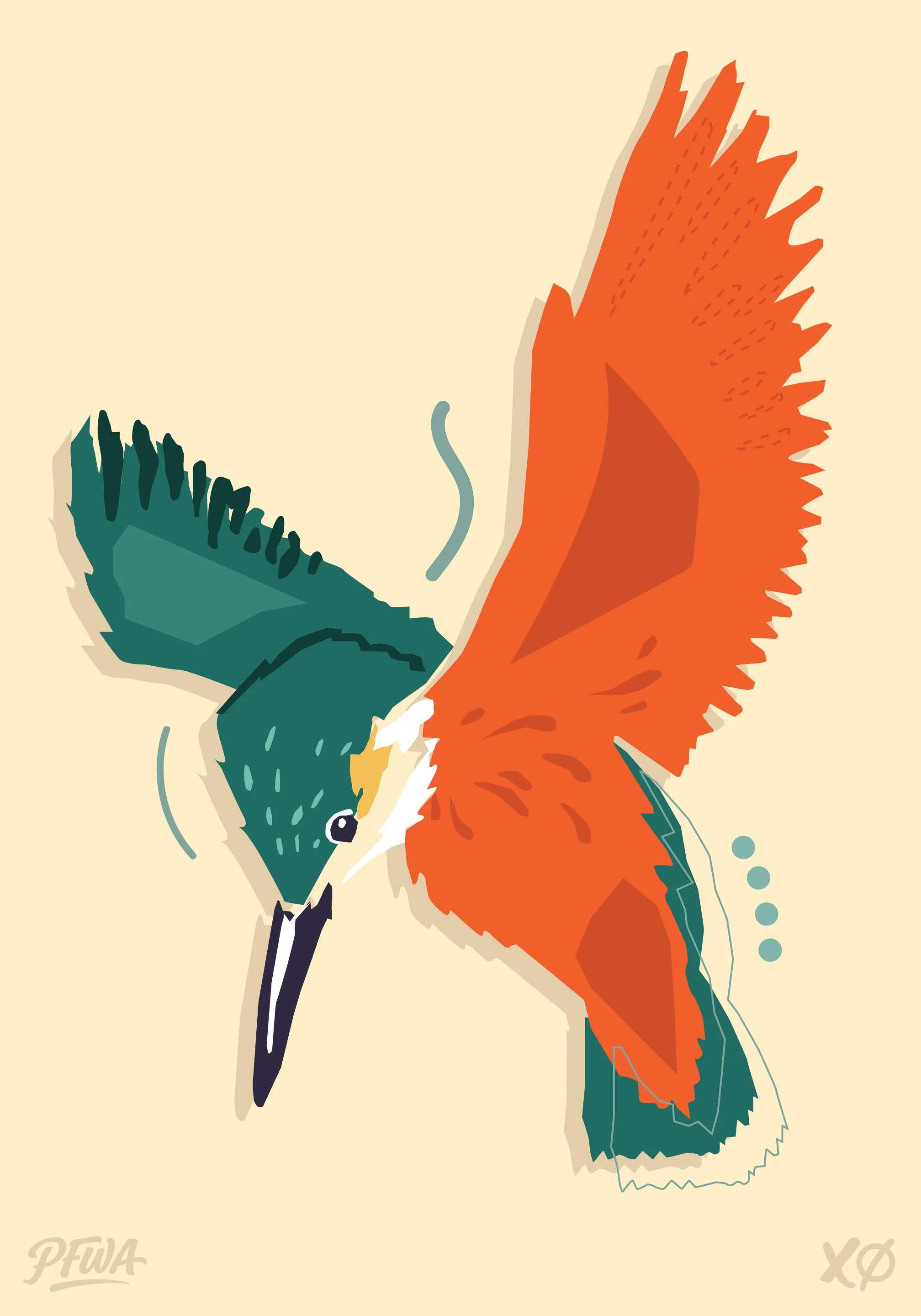
Kingfisher Study: Color, Movement, and Observation
I've been continuing to build out my Everyday Studies series, using it as a place to explore new subjects, color combinations, and ways of simplifying forms. For this piece, I was drawn to the kingfisher's incredible color palette and sharp, distinctive silhouette.
Rather than focusing on realism, I wanted to capture the energy and personality of the bird through bold shapes, loose marks, and layered color. Pieces like this are an opportunity to stay curious, experiment, and keep pushing my visual language forward one study at a time.
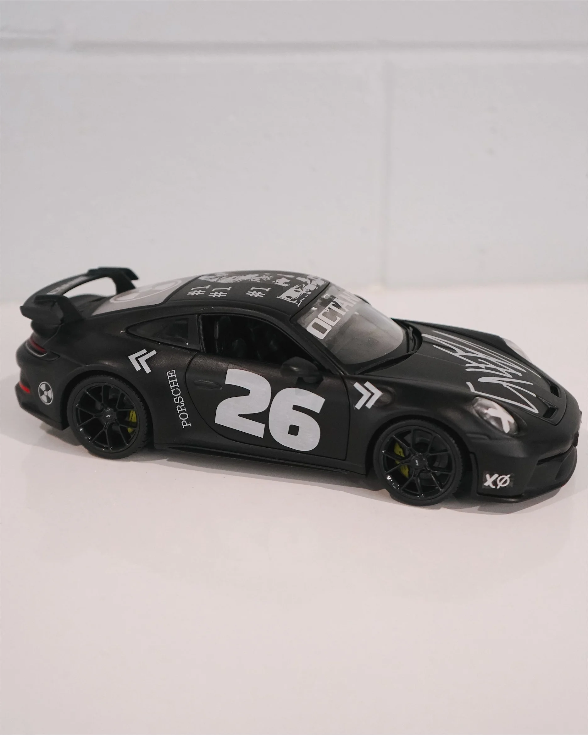
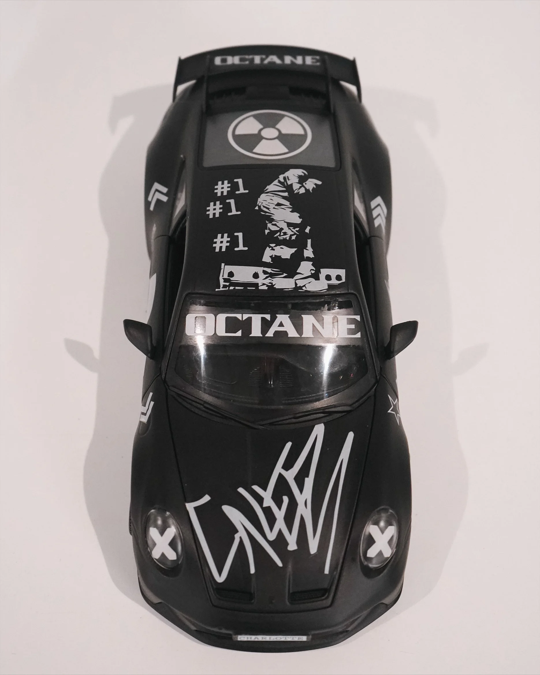
Don Toliver x Charlotte Hornets Custom Porsche 911 GT3 Collaboration at Spectrum Center
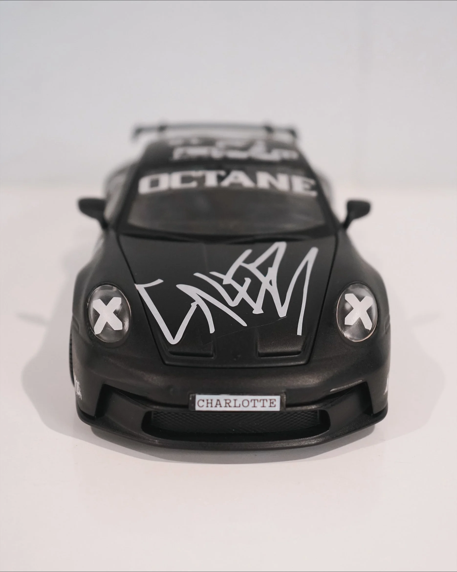
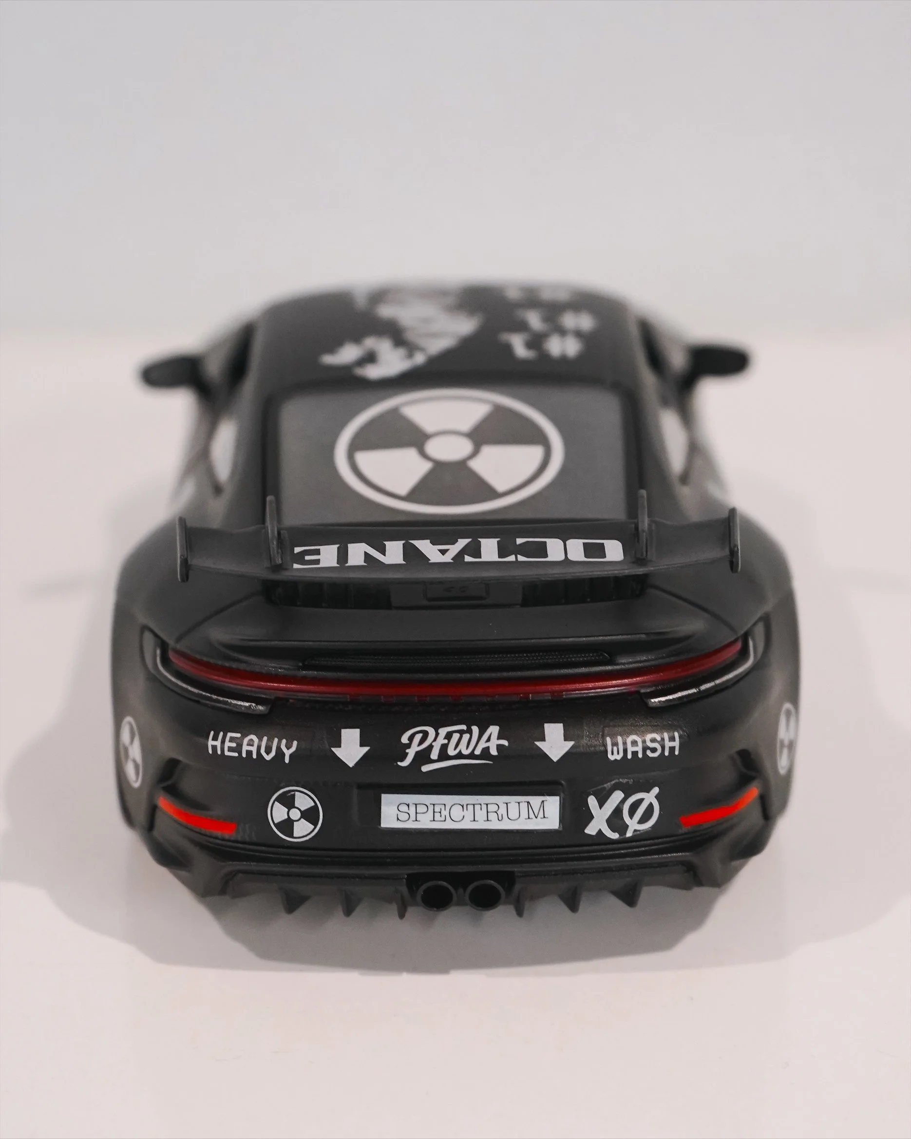
I recently partnered with the Charlotte Hornets and Spectrum Center to create a custom Porsche 911 GT3 inspired by Don Toliver’s latest album, Octane, for his Charlotte performance. The project blended motorsport culture, music, sports, and contemporary art into a one-of-one art car designed specifically for the event experience. Using a matte black base paired with bold monochromatic graphics, the design incorporated custom Octane branding, racing-inspired iconography, Charlotte references, and Hornets elements throughout the vehicle. The goal was to create something that felt aggressive, collectible, and immersive, almost like a rolling installation piece parked somewhere between luxury automotive culture and streetwear-inspired design. Projects like this continue to push my work beyond traditional murals into entertainment partnerships, experiential branding, custom vehicle design, and large-scale cultural collaborations.
Animal Welfare Illustration – “Care From Within” (2026 Print Release)
There’s a lot that goes into animal welfare that people don’t always see.
“Care From Within” was built around that idea, layering forms, color, and negative space to reflect the many moving parts behind care, protection, and responsibility. At the center is a cat and dog silhouette, simplified but intentional, surrounded by fragmented shapes that represent the broader system supporting them.
The goal wasn’t to overcomplicate the message. Just to create something that feels honest, structured, and grounded in purpose.
This piece sits a little differently than some of my other work. It leans more into meaning while still holding onto the same visual language, clean shapes, controlled distortion, and a focus on composition over detail.
“Care From Within” is now available as a limited edition fine art print, with only 10 produced. Each print is hand-signed, numbered, and includes a certificate of authenticity.
Printed at 13″ × 16″ on archival-quality paper using fade-resistant inks, it’s built to last and designed to fit standard frames.
If you’re connected to animal welfare, or just appreciate work that carries a bit more weight behind it, this one speaks for itself. Shop the print here!
BMW 2002 Turbo Illustration – “Widebody Red” (2025 Print Release)
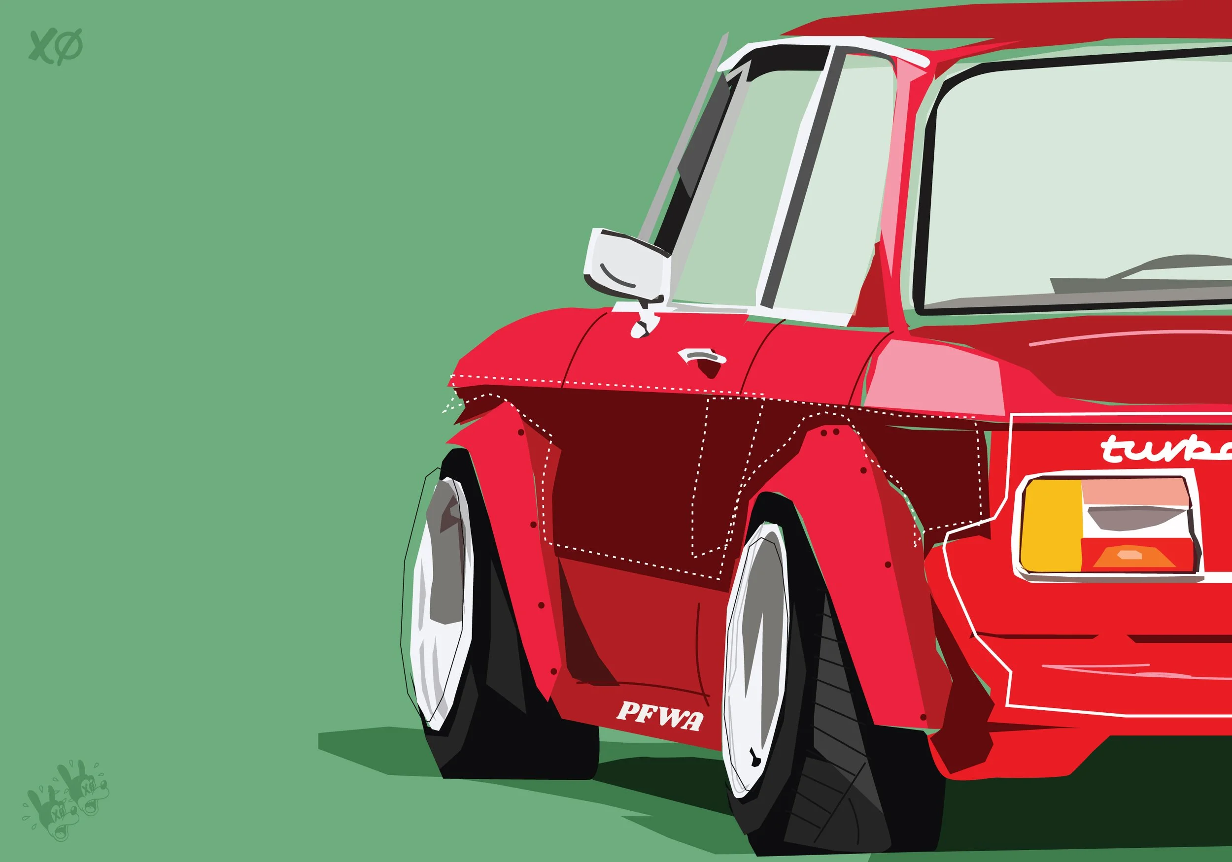
There’s something about the BMW 2002 Turbo that just feels right. No overthinking it, just raw shape, stance, and attitude.
This latest release, “Widebody Red,” is part of my ongoing automotive illustration series. It’s built around exaggeration in the right places, the flared rear, the compressed proportions, the way the car feels planted even in a static composition. Less about perfect realism, more about presence.
I leaned into the widebody treatment here to push that idea further. The fragmented paneling and simplified color blocks are intentional, stripping things down while still holding onto the identity of the car. It’s aggressive, but controlled.
This one sits in that space between classic automotive culture and contemporary illustration. The 2002 Turbo already carries so much weight historically, so the goal wasn’t to reinvent it, just to reinterpret it through my signature illustrative style.
The print is available now as a limited edition of 10, hand-signed and numbered, each with a certificate of authenticity. Printed at 13″ × 16″ on archival paper with fade-resistant inks.
If you’re into BMWs, vintage performance, or just strong graphic automotive work, this one speaks for itself. Scoop yours here.
Dogwood Study #2 (2026) – Everyday Studies Series by Kyle Mosher
I’m kicking off 2026 with a new piece from my ongoing Everyday Studies series.
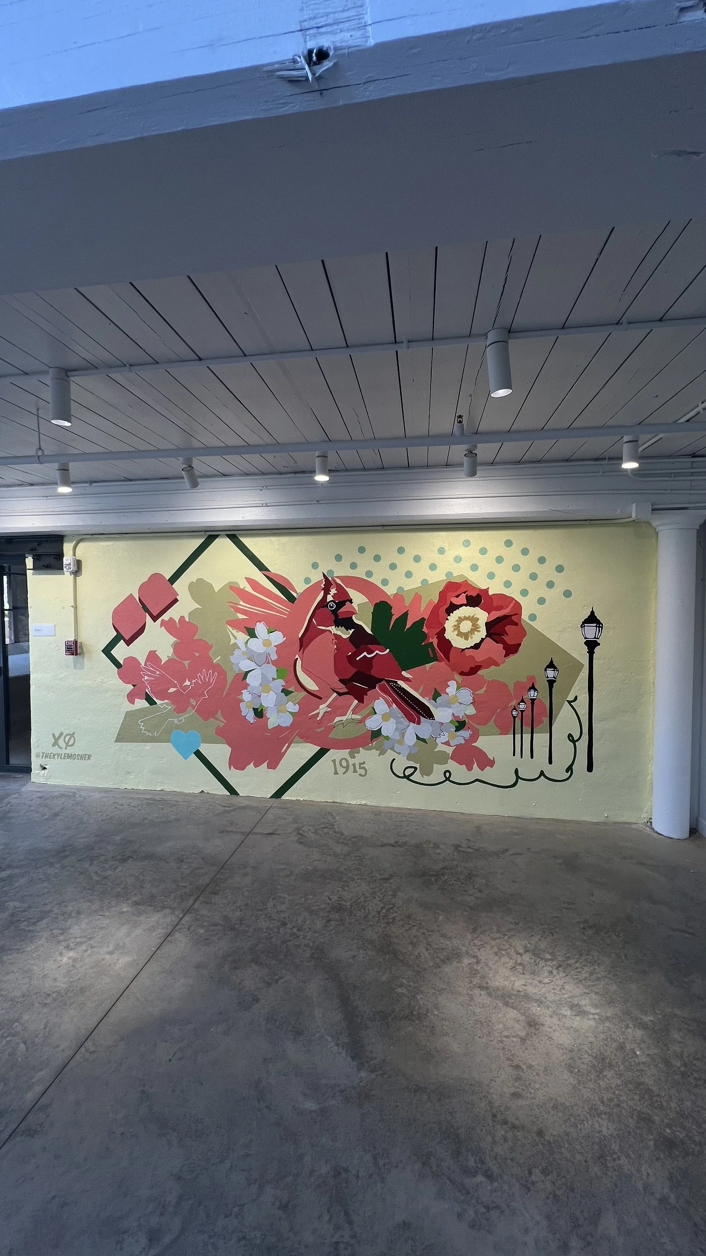
This one centers around the North Carolina dogwood, something that feels both familiar and iconic, but easy to overlook in everyday life. The goal with this series has always been to slow things down and reframe those moments, translating them into something bold, graphic, and intentional.
With Dogwood Study #2, I leaned into a warmer, more grounded palette. The dusty olive background pulls everything together and gives the piece a sense of cohesion, while still allowing the cream petals and saturated reds to hold their own. It’s a balance between restraint and energy. This is something I’ve been continuing to refine across the series.
Visually, this piece sits right at the intersection of flat color fields and loose, gestural linework. There’s no gradient or illusion, just shape, color, and composition doing the work.
Like all pieces in the Everyday Studies series, this is about finding weight in simple subjects. Taking something that exists all around us and pushing it into a space where it feels considered, elevated, and lasting.
Limited edition prints are available now. Each comes hand signed, numbered, and with a certificate of authenticity. Scoop yours here.
New Mural at Inizio Pizza in Birkdale Village | Huntersville, NC Wall Art by Kyle Mosher
New Mural at Inizio Pizza in Birkdale Village (Huntersville, NC)
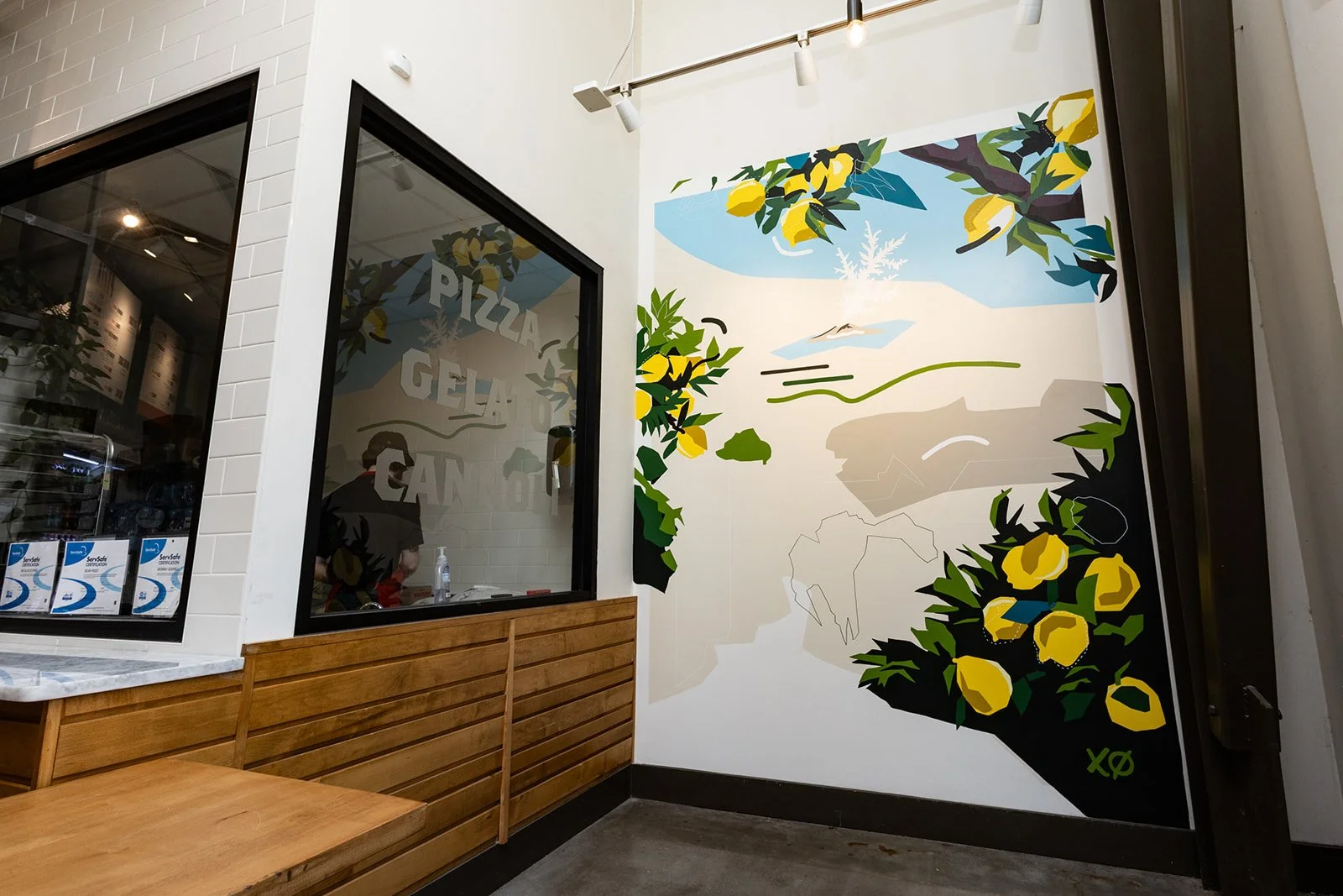
If you’ve been through Birkdale Village in Huntersville, North Carolina recently, you might’ve noticed my mural sign outside of Inizio Pizza. I had the chance to design and paint two custom interior murals for their newest location, and it was one of those projects that feels like a perfect blend of place, food, and atmosphere.
The murals was designed to complement Inizio’s modern, clean interior while pulling inspiration from Italian coastal colors, fresh ingredients, and the energy of a bustling pizzeria. Lemons, greenery, movement, and the joy of food all became visual anchors throughout the piece. The goal was to create something that feels lively and warm something that adds to the experience of being in the space without overpowering it.
Inizio Pizza has built a reputation for high-quality, fast-casual Neapolitan-style pizza, and the visual identity of their restaurants plays a big role in how customers experience the brand. This mural was created specifically for the Birkdale Village location to feel site-specific, rooted in the architecture and flow of the dining area.
From a design perspective, I wanted the mural to live naturally within the restaurant—something that feels intentional whether you’re grabbing a quick slice, meeting friends for dinner, or just passing through the space. Public art inside commercial environments should feel like part of the environment, not an afterthought.
Projects like this are why I love creating murals for restaurants and hospitality spaces across the Charlotte area and beyond. When art becomes part of the everyday experience where people gather, eat, and connect—it changes how a space feels in a subtle but meaningful way.
If you’re in the Huntersville or Lake Norman area, swing by Inizio Pizza at Birkdale Village and check it out in person. And if you’re a business owner looking to bring custom mural work into your space, feel free to reach out.
Looking to bring a custom mural into your restaurant, office, or retail space? Let’s collaborate.
When Hockey Became Culture
For decades, hockey was the overlooked sibling of North American sports. Beloved by diehards but rarely celebrated in the mainstream, it lived in the shadows of basketball, football, and baseball when it came to cultural influence. Jerseys weren’t fashion statements. Players weren’t marketed as style icons. The game felt trapped on the ice.
But something changed.
A new generation of young stars is rewriting the narrative. Players like Auston Matthews, David Pastrnak, Trevor Zegras, Cale Makar, and Jack Hughes aren’t just athletes, they’re cultural figures. They’ve embraced fashion, music, and personal branding in a way hockey has never seen before, bringing the sport into the same cultural conversations as the NBA. Suddenly, hockey isn’t just a game, it’s a movement.
That cultural shift is being reinforced by the league and teams themselves. Artists, musicians, and designers are stepping onto the ice:
Justin Bieber x Drew House created a bold, reversible “Next Gen” jersey for the Toronto Maple Leafs featuring smiley faces, Toronto skyline motifs, and tie-dye that debuted during the Next Gen Game. And Bieber even served as celebrity captain of Team Matthews at the 2024 NHL All-Star Game. Vanity FairPeople.comGQ
Detroit Red Wings & Columbus Blue Jackets unveiled auto- and military-inspired jerseys for the 2025 Stadium Series, drawing from Detroit’s automotive legacy and Ohio’s Civil War history—bringing storytelling directly into uniform design. Midland Daily News
The Avalanche’s Reverse Retro jersey reimagined its Quebec Nordiques past with a clean, modern aesthetic that drew praise for elevating the team’s visual identity. Axios
These projects show that hockey has grown up, its design and storytelling are now part of broader cultural currents.
For me, this moment is deeply personal. I grew up on the ice. Hockey was my first love before art fully took hold. Hockey’s design language is powerful: bold jerseys, sculptural gear, iconic masks, and the cold glow of arena lights. These elements beg to be reimagined through illustration, still life, and fine art. Just like sneakers, cars, and pop culture, hockey becomes the next touchstone I reinterpret, bridging my personal story with the sport’s cultural rise.
This is only the beginning. I’ll be exploring hockey in upcoming works, still life studies of gear, portraits of players, and abstracted visuals that capture the game's atmosphere. It’s both a way to honor my past and to join hockey’s future as it claims its rightful place in mainstream culture.
Art has always been my way of reframing the world around me. And right now, hockey has become culture, that makes it the perfect canvas.
Everyday Studies: Arance Crema & Arance Menta by Kyle Mosher
The newest additions to my Everyday Studies series explore the poetry of simple citrus branches through an Italian lens: Arance Crema and Arance Menta. These two works take the same core composition and shift its emotion through palette and atmosphere, creating a study in how color alone can reshape narrative.
Arance Crema (2025), sits in a warm, mellow register a soft cream field that lets the oranges pulse with subtle heat. The piece feels sunlit, quiet, and measured, drawing from the earthy calm of Mediterranean mornings.
Arance Menta (2025), on the other hand, introduces a breezy mint tone that sharpens the greens, energizes the composition, and lends the subject a sense of freshness and renewal.
Like all works in the Everyday Studies collection, these pieces begin as observational sketches and evolve into explorations of geometry, gesture, and contemporary pop-art language. They’re studies not just of objects but of how mood, tone, and color can completely transform the everyday.
Kyle Mosher on Zibra Podcast: Creative Evolution & Brand Growth
I recently joined the Zibra Brush & Banter podcast to discuss my creative evolution from early fine-art foundations and designing sneakers at PUMA to establishing myself as a multidisciplinary artist working across murals, illustration, and my lifestyle brand, Paid For With Art. We talked about how authenticity, consistency, and long-term thinking have shaped my approach to building a sustainable creative business and developing brand collaborations that align with my vision.
The episode also digs into how fatherhood and legacy influence the way I create and the future I’m building as an artist and entrepreneur. It’s a candid look at the mindset behind my work, my approach to growth, and how I’m blending art, design, and lifestyle into a unified brand. You can listen to the full episode here: Zibra Brush and Banter Podcast
The Mecklen Hotel Mural — A Hornet’s Nest of Revolution
Charlotte — the Queen City — was born from rebellion. Inspired by the city’s historic nickname “Hornet’s Nest of Revolution,” this 60-foot mural for The Mecklen Hotel under Marriott’s Tribute Portfolio celebrates that same fearless spirit — bold, defiant, and unmistakably ours.
Hand-painted from top to bottom, the design blends The Mecklen’s modern identity with Charlotte’s legacy: honeycomb geometry for unity, dogwood blooms for North Carolina pride, and the hornet itself as a symbol of resilience. Every shape and color was chosen to reflect strength, balance, and a sense of belonging — a visual story rooted in the city’s past but painted for its future.
This project was a true team effort. Huge thanks to my amazing crew — Ali and Brandon — for helping bring this vision to life. Eighty feet of paint, patience, and pride. Welcome to The Mecklen.
Behind the Scenes with Zibra
Earlier this month I teamed up with Zibra—a Charlotte-based brush maker with national distribution—for a studio + mural photoshoot capturing my process, tools, and texture work.
These are brushes I actually use on murals, so the partnership is a natural fit. Big thanks to photographer Elizabeth Sellers for bringing the energy and dialing in the shots.
Why Zibra
Zibra makes high-quality, accessible brushes for artists, makers, and DIYers. It’s dope to rep a brand with national reach that also calls Charlotte home.
More Than Brushes
This sponsorship is about craft, community, and telling the story behind the work. You’ll see these images across Zibra’s channels and mine—more coming soon.
Explore Zibra: enjoyzibra.com
Photographer: Elizabeth Sellers